Welcome to MMA100 Week #5!
Here is this week’s useful information and class resources:
*Did you miss Week #4’s Post? Go Here
*Did you miss Assignment #2’s Details? Go Here
**Students in MMP and MMA classes who need extra help have access to tutors in the Learning Resource Center. See tutoring schedule here: https://www.bmcc.cuny.edu/students/lrc/in-person-tutoring/tutoring-schedule/.
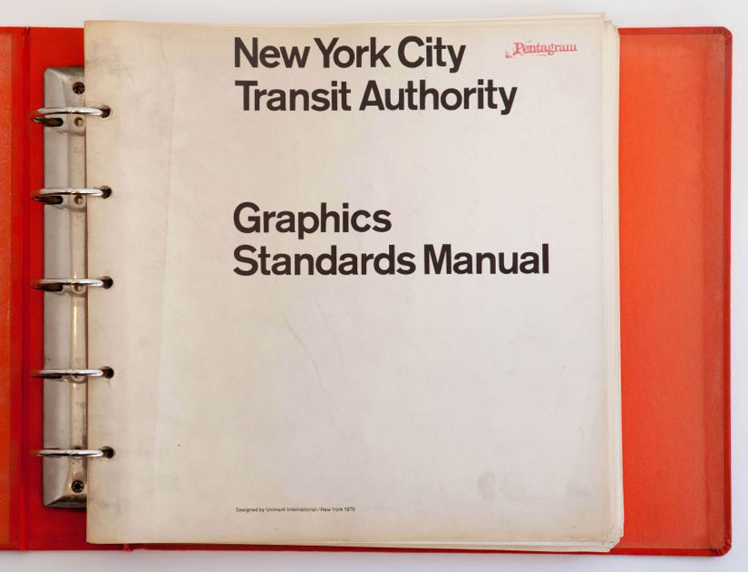
Lets check out the NYC Graphics Standard Manual and discuss it – Each student will leave a comment at the bottom of this page: https://openlab.bmcc.cuny.edu/mma100_foundations_of_digital_graphic_design/2019/09/25/the-nyc-transit-authority-graphics-standard-manual/
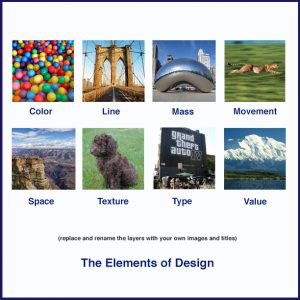
Project #2 – Lab Work session on – Elements & Principles: (The Vocabulary is Here)
**Both documents will be saved Via Photoshop – File -> Export -> Save for Web –> select jpg. **Please send by Friday 9/27/19 – Send Via e-mail to rseslow@bmcc.cuny.edu
———————————————————-
Assignment #3 Discussion – Class exercise :: Adobe Illustrator. Creating shapes with the shape builder tool. Working with layers, simplifying and reducing images. Working with color, locating color books and pantone colors.
Lab Tutorial – Lets take a tour of Adobe Illustrator and practiced creating new documents and setting up our art boards for print production.
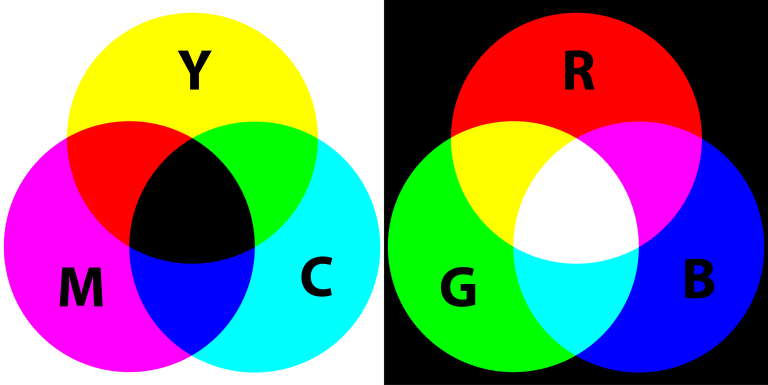
Color Theory!
Adobes awesome Color Wheel Simulator (must see)

Let’s take an additional tour with Adobe Wizard – Terry White
10 Things Beginners Want To Know How To Do (subscribe to Terry’s Channel!)


Weekly Inspiration & Resources of Relevance:
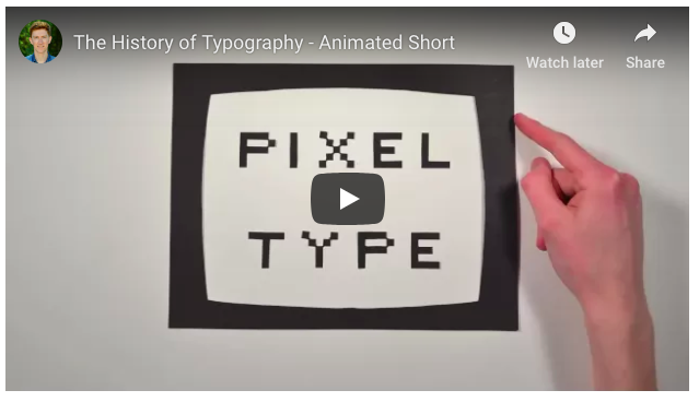
An Introduction to Typography & Its History – Letterforms / Designing with Type
Examples of Typography in Poster Design
**Must See – 1970 – NYC Subway – MTA – Graphics Standards Manual

I love how it breaks down how much thought had to go into something I use to think was just put together esspecally the arrow. The person had to think of an arrow and the angles for it and how can it fit perfectly no matter which way it need to be pointed. I also like to see the different colors and letters we don’t use any more. Why did we had letters that doubled instead of going to the letters that wasn’t used. why is the arrow pointed and not curve? where did the diamond come from for the 7 train.
Hi Lynell – thank you for the response on this! Great answers and questions! I think you meant to post this here – https://openlab.bmcc.cuny.edu/mma100_foundations_of_digital_graphic_design/2019/09/25/the-nyc-transit-authority-graphics-standard-manual/