Welcome to MMA100 Week #2!
We’re BACK!
Here is this week’s useful information and class resources:
Need a recap of Week #1 – Go Here
***Here is the ZOOM recording of tonight’s class with the Assignment #1 Tutorial
Passcode: ukm3YY$!
**Update on accessing Adobe / Software / Remote Access from home –
Student Adobe Account Access
Some students will have access to Adobe, others who registered later or just before the start of the semester, will not yet have access. Students with questions or problems can also fill out our Tech need form (below).
- Post with more info on Spring 2021 Adobe Situation
- Post with instructions for students on Accessing Adobe
Student Access to Technology-
There are laptops, desktops, chromebooks and hot spots available for students. Currently only students in upper-level media production classes have access to laptops and desktops. All students can request chromebooks and hot spots. Students can also request help with downloading and installing software related to their course. All requests can be done through our Spring 21 Tech Need Form.
- Student Tech Need Form (any tech need): https://bit.ly/mea-tech-need
- Post on Remote Access Labs (updating soon)
John Marshall, jmarshall@bmcc.cuny.edu and Jerry Spencer jspencer@bmcc.cuny.edu, are responding to the form and helping match students to resources.
We will begin tonight class by recapping week #1’s introductions to the course as well as jumping into assignment #1 – our first assignment! The first assignment has 3 parts and I will be sharing a series of tutorials during our Zoom time. I will give a demonstration on how to prepare your design layout, place and resize images, apply layers and also preparing your final designs for output on the web and in print.
Remember, each assignment will have its own page with all of the specifications needed to work on, complete and submit the assignment. Assignment #1 can be found here.
* a Video tutorial from week #2’s Zoom class of assignment #1 – part 1 will be posted on the assignment #1 page after our class**
Becoming familiar with terms and items like: “design briefs, project sheets and project specifications” are essential to the design industry. We will be come familiar with this process and following a simulation like experience 🙂
We will discuss the progress and submissions process of your finished assignments and how to send and share them via google drive. We will discuss the maintaining of your files and data and how to keep it safe and easy to access.
Assignment Submission guidelines:
When your assignment / assignments have been completed please add them to our class google drive shared folder (link is on blackboard).
Please create a folder for yourself with your first and last name. And, please name your files with your name, assignment# & assignment status – here are a few Example file names – they may looks like this:
Ryan_Seslow_Assignment#2_progress.JPG
Ryan_Seslow_Assignment#2_FInal.JPG
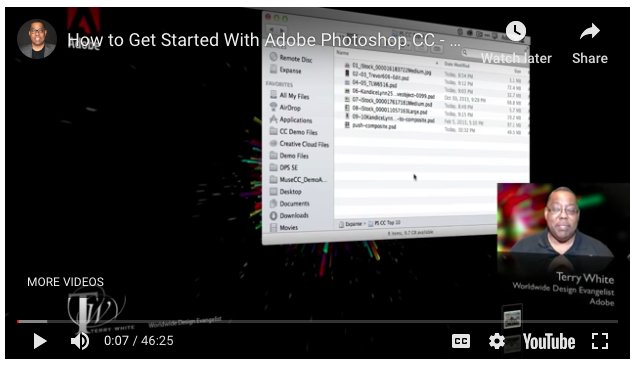
Tutorial – Getting further acquainted with Photoshop – (Terry White is one of my favorite Adobe evangelists!)
Inspiration / Resources: Graphic Design Trends from 2020
::Vocabulary::
The Elements of Design:
Color – typically known as hue. This word represents a specific color or light wavelength found in the color spectrum, ranging circularly from red to yellow, green, blue and back to red.
Line – is a line just a series of points? Or is it the best way to get from point “A” to point “B”? As a geometric conception, a line is a point in motion, with only one dimension – length. Line has both a position and a direction in space. The variables of line are: size, shape, position, direction, number, interval and density. Points create lines, lines create shapes or planes and volume.
Mass – Here, mass is interchangeable with volume. A mass is a solid body or a grouping of visual elements (line, color, texture, etc.) that compose a solid form. Volume is a three-dimensional form comprising length, width, and depth. Three-dimensional forms contain points (vertices), lines (edges), and planes (surfaces). A mass is the two-dimensional appearance of a three-dimensional form.
Movement – Also known as motion. This element portrays the act or process of changing place or direction, orientation, and/or position through the visual illustration of starting or stopping points, blurring of action, etc. This is not animation, although animation is an end product of movement, as well as other elements of design.
Space – A two-or three-dimensional element defined by other elements of design.
Texture – A technique used in two-dimensional design to replicate three-dimensional surfaces through various drawing and media techniques. On three-dimensional surfaces, it is experienced by touch or by visual experience.
Type – Also known as typography, and it is considered an element in graphic design. Although it consists of elements of design, it is – in itself – often an element in the form of visual communication.
Value – Another word for the lightness or darkness of an area. Brightness measured in relationship to a graded scale from white to black.
The Principles of Design:
The principles of design are applicable to all design disciplines including – but not exclusive to – architecture, art, graphics, fashion, industrial design, poetry, writing, and web design.
The principles of design are tools used to format the elements of design.
Balance – The elements of design converge to create a design or arrangement of parts that appear to be a whole with equilibrium.
Contrast – The “automatic principle.” Whenever an element is placed within a format, contrast is created in the various elements. Can be emphasized with contrast in size, shape, color,
Direction – Utilizing movement to create the visual illusion of displacement.
Economy – A principle operating on the “slim.” Especially important when dealing with clients, where their product or service is more important than the elaboration of design elements. Can also be considered “precise,” or “simplistic.” Or, it can be considered great design.
Emphasis – Also known as dominance. This condition exists when an element or elements within a visual format contain a hierarchy of visual importance.
Proportion – A two- or three-dimensional element defined by other elements of design.
Rhythm – A recurrence or repetition of one or more elements within a visual format, creating harmony.
Unity – Oneness, Harmony, The condition of completeness with the use of all visual elements within a format.


