Weeks #8, 9 & 10 Info & Resources
Welcome Back!
Lets take a look at student progress on assignments – what would you like to share?
**Quick reminder – sharing work in zoom is not mandatory but super helpful in the development of your work. When you complete assignments is it crucial to send me an e-mail to locate the work in your folder in our google drive. Did you forget to do this recently? Thank You!
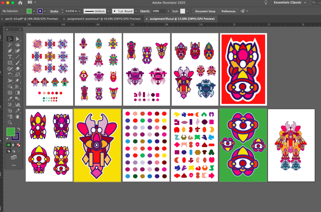
We will continue to focus on assignment #3 tonight in our zoom class and I will be covering another video demonstration working with adobe illustrator and on building the framework of Assignment #3 part 2 and moving into part 3 (tutorials for the project are below and also on the assignments page)
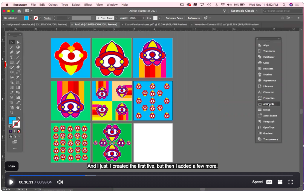
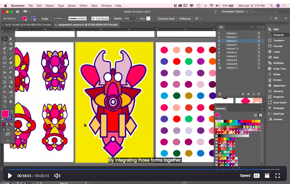
***Here is the Video tutorial below from Class on 4/14 -covering file formats and Part 3 of this assignment – Have FUN!!
Passcode: %8Ljwxyu
Below is the tutorial from class on 4/7 – covering Parts 1 & 2 of this assignment:
Passcode: e.H73H+a
Assignment #3 – Illustrator Tutorial from class on 3/24 below
Passcode: 9Xbx7^2^
Weekly Resources & Inspiration:
Adobe Illustrator. Creating shapes with the pen tool, the pathfinder and the shape builder tool. Working with layers, simplifying and reducing images. Working with color, locating color books and pantone colors.
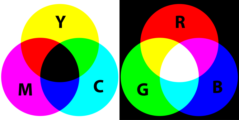
Color Theory!
Adobes awesome Color Wheel Simulator (must see)
More Resources of Relevance:
An Introduction to Typography & Its History – Letterforms / Designing with Type
Examples of Typography in Poster Design
Weekly Design / Designer Resource –

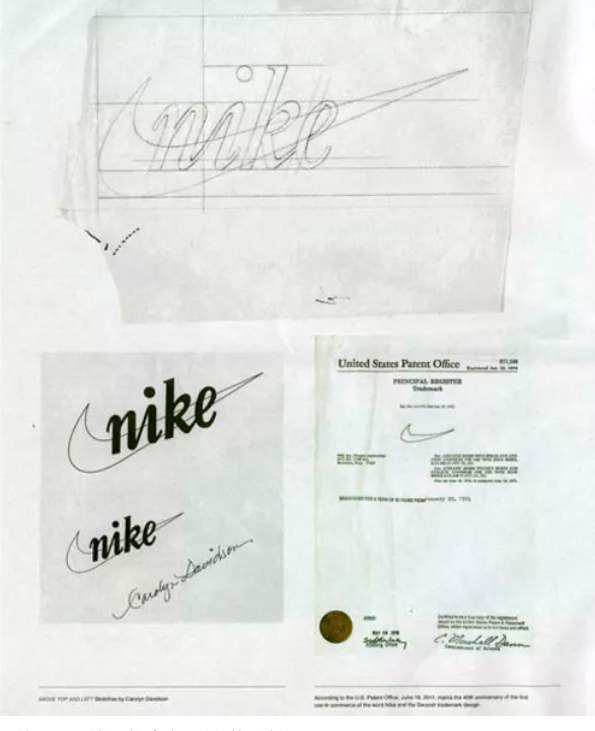
Carolyn Davidson
(Image & content source quoted from – creativebloq.com)
*Please leave your reactions/responses in the comments section below.
Questions to consider: What do you think about the initial payment for the icon / design job? Were you aware of this story / designer? Do you think that the Nike “swoosh” still holds up today? What do you think it symbolizes beyond the description below? How do you think the Nike company will remain relevant over the next 10 years +, how will design play a role?
“There aren’t many logos that are more recognized the world over than Nike’s iconic swoosh. It’s often the simplest ideas that are the best and the Nike mark proves it.
Graphic designer Carolyn Davidson designed the logo as a student at Portland State University in 1971 – and was paid $35 for it by Nike founder Phil Knight (Knight met Davidson in an accounting class he was teaching.)
The tick-like logo was seen as a symbol of positivity, but it’s actually the outline of the wing of the Greek goddess of victory whom the brand was named after. In 2011, Davidson told OreganLive.com that “it was a challenge to come up with a logo that conveyed motion” and that Philip Knight was very impressed with the stripes of rival company Adidas – it was increasingly hard to come up with something original.
As Nike grew in the 1980s, Philip Knight gave Davidson an undisclosed amount of Nike stock (making up for the tiny fee for the logo, we’re sure).”
More Source Info – https://www.creativebloq.com/graphic-design/names-designers-should-know-6133211


