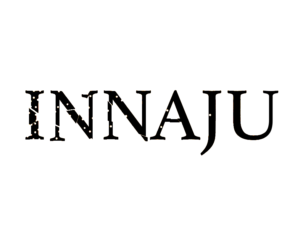
A design idea for a company logo. The idea was to show that even if your origins were difficult or damaged, you can eventually make it/become whole. The dirty, cracked and separated letters represent how the company started off from hard times, and as the letters move forward towards the end of the word, the letters pull together, become less cracked, and less damaged to show the progress made. And as you reach the end of the letter “U” it is clean, smooth and without damage to show the company’s success.
Welcome to the BMCC OpenLab!
BMCC’s OpenLab is an online platform where the College’s students, faculty and staff can come together to learn, work, play and share ideas.
Support
Help | Contact the OpenLab | Terms of Use | Privacy Policy | Credits
Please use the above links if you need more help in using the OpenLab.
top
