Letterform Composition

Letterform

Created in Spring 2019

The objective of this project was to create a series of different compositions with typography and color. We needed to understand how color makes an impact on composition. Typography and color always need to find harmony, so that a design can have a visual appeal to the composition. the most challenging part about this project was creating a series of nine compositions that involved finding harmony with text and color. I had problems when composing the first three designs because it required only using text and the black and white colors. It was a difficult process because I needed to find a way to make the design visually appealing, clean, and legible. But I began to create many different sketches with letters scattered all over the place of the artboard until I found one sketch that I liked and placed it, in illustrator and continued this process for all the remaining eight projects. Because of this project, I realized that color and text play a huge role when trying to design a well-composed project because the text needs to always be legible and that designs must always try to be visually appealing by plating text and color.

Comic Book Website Mockup


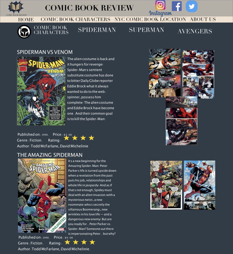
Comicbook Review Page
Website Homepage

Created in Spring 2019

The objective of this project was to create a website mockup on a certain subject I was interested in. The task required me to create a website and an app for a subject I was choosing. The subject that I chose was on comic books because I’m a huge fan of reading about different comic characters. The website would allow people to discover new comic books that have released recently. And would also recommend people to the best comic books for certain comic book characters, this would also help people get engaged in reading. And lastly, the website would indicate comic books stores were people would be able to purchase the comic books that were reviewed on the site. The target audience focused on teens from the age of 13 through 20. The content within the website would be pictures of different characters, information on reviews of certain comic books, and comic book stores location. The only challenging task about this project was being able to create a logo for the website because it was one of the first logos that I created. by creating different sketches and ideas for a logo I was able to narrow it down to the logo I placed on the site which I felt was simple, memorable, and modern. Overall using adobe xd to create this website mockup was a lot of fun, and I was satisfied with the work I created.

Tour Map Guide

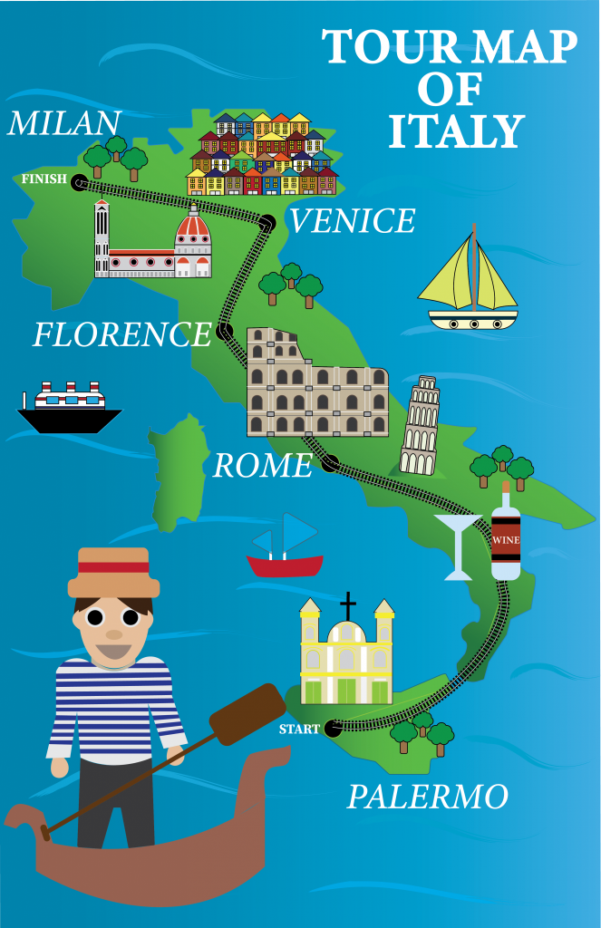
Tour Map Guide Of Italy

Created in Fall 2019

The illustration map reveals where I would like to visit in the future. The map acts as a guide through the areas I will go to when visiting Italy. In the map guide, you can see the many destinations that I wanna cover when visiting Italy like, Rome, Venice, Milan, etc. One of the problems with this project was deciding what type of guide map I wanted to create, and how I would place it in illustrator. So what I decided to do in order to solve this problem was to begin to sketch different ideas and formats for the map. I created five different map ideas and started creating the illustrations. My role throughout this project was to create the entire map guide, place color, typography, and create a well-composed map guide of Italy. This map guide received positive feedback from my peer as well. overall this was one of my favorite projects that I have made which made my passion for illustration grow.

Bottle Label

Label_bottle copy

Created in Fall 2018

For this project, my task was to improve and resign a drink label that I felt needed an update. I decided to redesign one of my favorite drinks, Naked. When looking at the original label I felt the design was too overwhelming. It had too many imageries all over the bottle, and the text was not legible which made it very difficult to read. My solution for this was to redesign and update the label by creating different sketches for the label. I added different colors to the label and text as well. And also gathered information on the product. I felt that the label should be more modern, clean, and simple. I decided to create the illustration of the fruits that were within the drink and placed it in the middle of the label and placed the logo of the company above the illustration. Lastly, to make the words more legible I decided to add a white stroke to the words, in order for the text to become more visible, and clear. Because of this decision, the text began to contrast with the background gradient. which made the label look more appealing. Overall the composition for the label felt simple, clean, and modern. This was the first design I created since entering college.

Logo’s For Clients

Mockup Logo For Client
logoPresentation

Created in Fall 2019

The objective of this project was to be able to create three different logos with different styles for two clients. I need to design six different logos in total. This project was one of my favorites because of the amount of work, and creativeness it required. One of my client’s industry was a clothing brand company, and the other client’s industry was a game developer company. Both clients had different needs and style’s for their logos. For me to proceed onto the next stage of creating the logo’s what I did was sketched and brainstorm many different logos for both clients. This was very difficult because both clients had different needs for their logos, but in the end, with good communication, it resulted in me composing six various style logos for both clients. I created the different illustrations, applied different color palettes, and placed text with the compositions. In conclusion, this was a thrilling project to complete and also satisfied both clients with their logos.

Logo Booklet


Booklet Cover
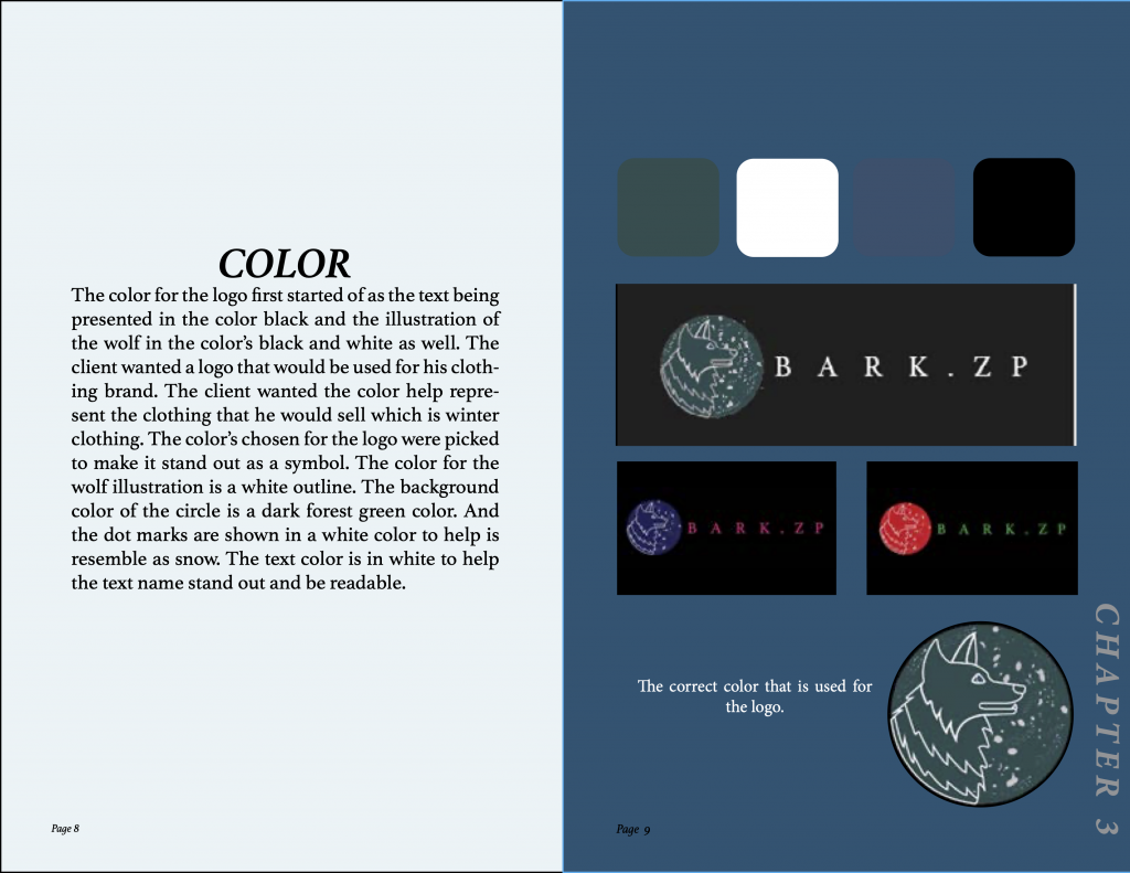
Booklet Color Page
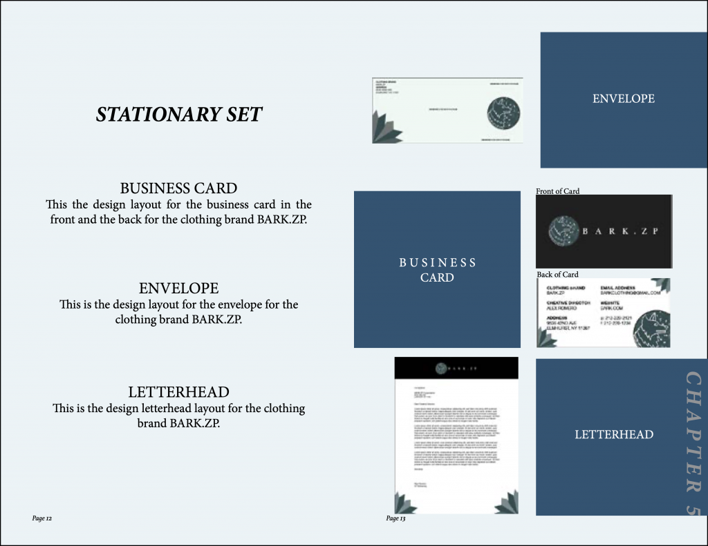
Booklet Stationary Set Page

Created in Fall 2019

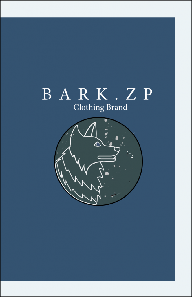
The objective was to create a booklet that identified the process I took to create a logo that was made for a client. The booklet needed to show the logo being placed in clothing, business cards envelop. Also, it needed to explain why the color of the logo was chosen, what was the font, and how can the client properly use the logo. The booklet will be guided to help other people understand the process of how this logo was created and how the logo should be properly used. One of the challenges that I faced when creating the booklet was developing a style for the booklet, but with different sketches and different color palettes, I was able to figure out the style I wanted for the booklet. The role that I took was placing images, creating sketches, creating envelopes, business cards, and mockups of the logo being placed in clothing.

Magazine Cover

Cover_magazine 1 copy
Magazine Mockup

Created in Fall 2019

The purpose of this project was to be able to create a unique magazine cover and the first two pages of the interior of the magazine. This was a challenging project that I worked for weeks on because I was not truly familiar with the InDesign program. But the way I overcame this challenge was to create multiple sketches for the magazine’s layout. I made multiple sketches for the cover and made many changes until I felt pleased with the composition of the design. I researched information on one of my favorite sports which was soccer. I gathered multiple images that I felt would create a visual appeal for the cover and interior of the magazine. Furthermore, I created a well-composed cover for a magazine and the interior of the first two pages. This was such a fun and challenging project to work on.