
By Melanie Meza Lucero
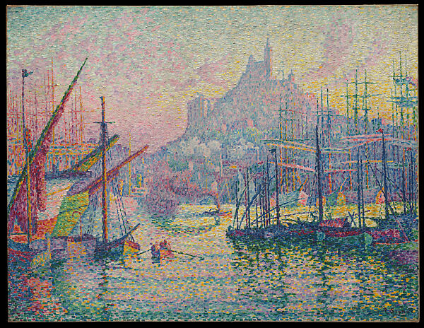
When I took a look at the painting I gasped as I fell in love with the colors and composition of it. They were bright and stippled onto the canvas in such a creative way. Some were stippled into the shape of sailboats and some of the other stippling dots were shaped into a river, creating a fascinating view that signac purposely painted for the viewers. I felt as if I were living in that picture, finally feeling pure peace flowing through my mind. I felt the breezy yet beautiful air come from my head to toe.
Signac’s choices of colors are such an eye opening sight. I see blue, pink, green, yellow, and a sort of black shade when coming around the sailboats. They all bring such a joyful yet calm feeling to the audience, especially to me. I love bright colors. They bring such a good sensation to the painting and really show how he felt when seeing this view in French Paris. He does such an amazing job on how and where he places the stippling to where he stipples a yellow in the sky representing a sunrise, a blue and green on the foreground showing it’s a beautiful river, a darkened landscape when it comes to the middle ground to show the shadows of the sailboats, and a cool blue in the background representing a church he found gorgeous. The way he’s angled his painting brings so much depth to the painting. The texture in the painting of soft but harsh stippling across the painting makes his effort look more alive. It’s hard to see unless you see it from up close but careful you’ll feel as if you are living in the painting the same way I did when having a close look.
His rectangular strokes of mixed colors on his painting all create perfect lines shaping all sorts of things for the viewers to picture. His impression on his painting really speaks out loud to me on how his trip was and honestly gives me such a summer feeling. I really felt and saw his mind getting spoken out loud to how things were at the time of this painting. He thoroughly expressed how his landscape is more on how the colors express emotions rather than reality, on how the landscape really was. He shows us how he goes from Impressionism to Neo-Impressionism with the given examples I provided about his painting on what he prefers.
His choice of elements helped me understand his work. To start off his texture helped me see his painting more clearly, his composition helped me see how he saw France, his lines helped me understand what was seen in his view. In general his techniques in where he placed his stippling and colors helped me see his vision on his trip. I got to feel what I felt like he wanted the audience to feel. I felt the bright colors lighten up the room other than my mood. I felt his
stippling as something so little but beautiful when it comes to creating a picture. It stays at The Metropolitan Museum of Arts where viewers get to experience what I first felt when viewing the painting.